STRONG NERDS
|
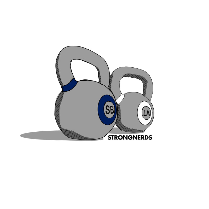
The client asked me to create a logo that advertises the two locations his company resides in. I first sketched out an idea with the company's colors, taking advantage of a typical kettlebell coloring.
The client also asked for the logo to have the color palette of their alma mater for the employees that work at the company.
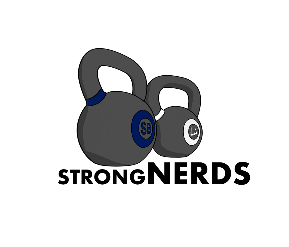
FINALIZED LOGO
The finalized logo emphasized the nerds part of STRONGNERDS because of the science that the client incorporates in training their athletes.
|